'Color' is all around us. It adds excitement and emotion to our lives. Everything from the clothes we wear, the pictures we paint, and our environment revolves around color. Without color, the world would be a much less attractive place.
Color is defined as:
noun
1. The property possessed by an object produces different sensations within
the human eye and brain system due to how the thing reflects or emits
light.
verb
2. Change (something) color by painting, dyeing, or shading it.
Color Characteristics
The four color characteristics, includes the following.
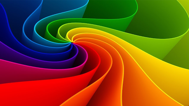
'Hue' is the name of the color or its 'hue family,' i.e., red, orange, yellow. For example, if the color of an apple is red, then the apple has a red 'hue.'

|
| Color as Hue |
'Hue families' contain all variations of that particular 'hue' or color, but what are hue families, and where do they come from?
In 1666, due to an outbreak of the plague, Cambridge University closed down temporarily, and one of its young and bright students, Sir Isaac Newton, was forced to spend that semester at his home in the country.
 |
| Newton's Publication |
During this time, Newton, at the young age of 24, accidentally discovered the visible spectrum of light from a prism in the window. When the sun passed through it, he observed the beam of light separated into multiple colors, like a rainbow. He then studied this phenomenon carefully.
He later published his theories in "Opticks," which details the various phenomena. Newton called it the "inflection" of light and the 'color spectrum.'
Today, we understand that white light contains all of the colors of the rainbow, which is why we sometimes see a rainbow after it rains and the sun shines through a mist. Sunlight passes through droplets of rain that act as a prism and split the light into the visible spectrum of colors.
The spectrum appears to make smooth transitions from color to color, but Newton divided the resulting beam into seven distinct 'hue families.' He called out red, orange, yellow, green, blue, indigo, violet, or ROYGBIV.
 |
| Light Refraction |
The eye, like the ear, responds to wavelengths or forms of energy that travel through space and the atmosphere. Sir Isaac Newton didn't realize it then, but he uncovered what we know today as the Electromagnetic Spectrum. It contains the visible light spectrum, and each 'hue family' has a different wavelength. Most animals see some color, but red and green are color-blind. Some insects see ultraviolet wavelengths, which we can't see.
 |
| The Electromagnetic Spectrum |
Since light contains all of the 'hue families,' when it hits an object, the object absorbs all of the wavelengths except the unique hue that it reflects back to us. For example, an apple absorbs all the hues and reflects only the red wavelength.
 |
| Newton's First Published Color Wheel.1 |
Newton wrapped the color spectrum around a wheel and published the first color wheel in his publication "Opticks." Today, physicists agree that there are only 6 distinct hue families based on their decreasing wavelengths. Newton included indigo to make the number of hue families equal to seven. He chose the number seven, reflecting the Ancient Greek belief that seven is a mystical number.
 |
| The Color Wheel |
Hue is a characteristic of color and can be used interchangeably with the color's name. The human eye can distinguish around ~ 7 million different hues or colors, i.e., 7 million different wavelengths can be seen within the visible spectrum.
References
1. Newton's First Published Color Wheel. Wikipedia. Retrieved in 2017 from https://en.wikipedia.org/wiki/Color_wheel.
Intensity, otherwise known as 'Chroma,' is a characteristic of color describing the brightness or dullness. Do not confuse 'chroma' with 'saturation.' Saturation refers to the colors that are created by a computer monitor rather than pigments or paints.
 |
| Color as Intensity |
Color Brightness or Brillance
Brightness is the intensity or purity of a pigment or color. Do not confuse it with value, which is the the lightness or darkness of a color. Paint colors are most vigorous when they are straight out of the tube. This is called 'mass tone or 'top tone.' Each color's mass tone may vary slightly from one paint manufacturer to another, depending on their proprietary recipe or the pigment concentration used.
Think uncontaminated color!
Straight out of the tube, any paint color is the most intense it will ever be before we dilute it with a medium or mix it with another pigment or color. Anything diluting the initial pigment concentration makes the color less intense.
 |
| Mass Tone |
Neutrals
Are duller versions of any color by comparison. Intensity appears to be influenced by adjacent colors and may appear brighter in certain situations!
Color appears to intensify when their color complements are next to each other! Bright colors will also appear brighter when surrounded by neutrals. Impressionists used these color relationships to make their colors appear more vibrant! It creates an optical illusion called simultaneous contrast.
 |
| The Impressionists used a combination of intense colors combined with neutrals. |
For example, if all of the colors in a painting are intense, nothing will appear that intense. This painting seems to be high chroma, but there are actually a lot of neutral colors used to surround the brighter colors, which create the illusion of bright color.
We create neutrals or "neutralize" a color by decreasing its intensity. There are several ways to do this. You can mix them with other colors or earth tones or use the following methods.
 |
| You can take any color and mix it in or add white or black. |
 |
| You can take any color and mix it in or add gray. |
 |
| You can take any color and mix it in or add the color complement. |
Chroma Scale
It is created with a gradation of two complementary hues from bright to dull to bright, with colors of full intensity at both ends of the scale and neutralized colors in between.
 |
| Chroma Scale created using color complements. |
Creating a chroma scale will help you determine the intensity of your color mixtures using complements.
When creating the scale, mixing colors with complements may darken your colors, making it hard to see how the complement affects the color. You may have to add some white to create the perfect chroma scale. However, don't confuse brightness with lightness; that's the following characteristic of color' value.'
Updated January 26, 2025
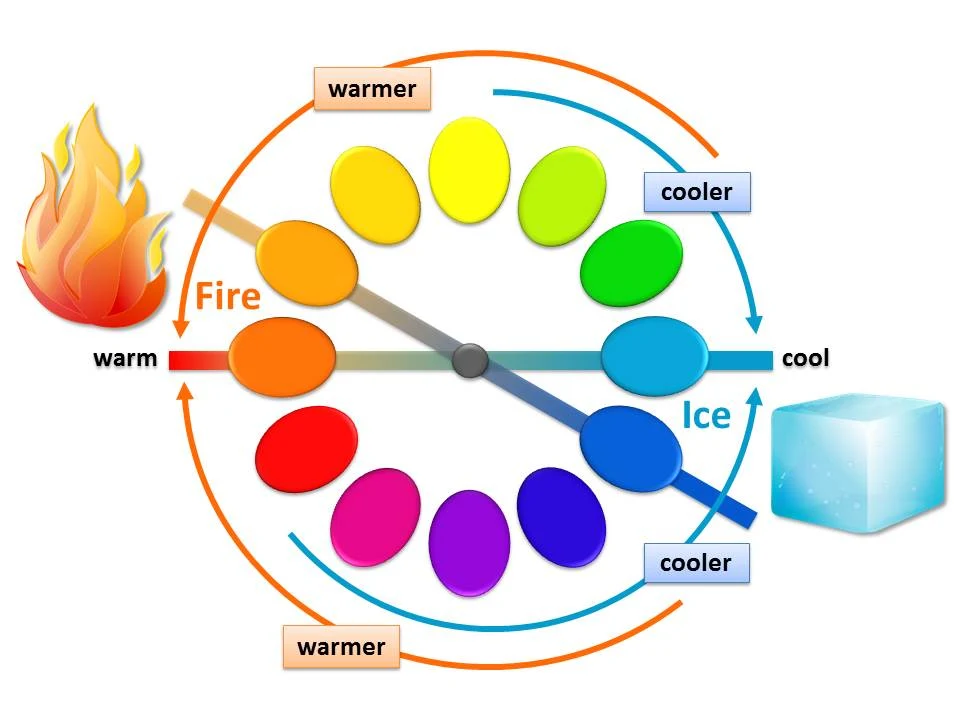
Temperature is one of the color's many characteristics. It describes the warmness or coolness of a hue or color relative to another hue. In nature, fire and ice are incredibly contrasting polar opposites.
 |
| Fire and Ice |
Color temperature was familiar to artists before the 19th century. However, in 1813, English artist Charles Hayter published this diagram in his book Introduction to Perspective, Practical Geometry, Drawing, and Painting, New and Perfect Explanation of the Mixture of Colors.

|
| Hayter's Warm/Cool Diagram |
The Temperature in Pigments
The warm and cool color diagram raised questions that caused multiple editions to be published.
Is every hue or color on the color wheel either warm or cool? Are some hues excluded as neither warm nor cool?

|
Color as Temperature |
A warm or cool characteristic can be assigned to any hue or color on a color wheel. All hues or colors within the visible spectrum of light are present. In this context, red and orange are always warmer colors than blue and green.
We can split the color wheel into the polar opposites of nature's 'Fire and Ice.' Fire is close to orange, and ice is close to blue. Note that with all hues in the color wheel, hues gradually get warmer as they approach orange (fire). Hues gradually get cooler as they approach blue (ice).
|
| Color temperature in pigments or paint is always relative to its surroundings. |
The confusion in Hayter's diagram comes when we take the hue or color off the wheel and put it into another context. Color temperature is always relative to its surroundings.
 |
| Pink is the cooler color or hue compared to the red hue. |
For example, when the temperature in our environment drops to 32 degrees Fahrenheit, it feels really cold. However, 32 degrees Fahrenheit feels relatively warm after being in an environment of 11 degrees Fahrenheit for a day or two.

|
| Warm vs. Cool |
Color temperature in pigments or paint works the same way. It appears relatively warmer or cooler to the hues or colors around it. This optical illusion is even more apparent within a single hue family or color.
Pink is a great example. It is generally a warm color used during Valentine's Day in cards or candy boxes. However, when pink is next to red, it becomes a relatively cool hue compared to red, as shown.
If we zoom in on a single hue family on the color wheel, blue gets cooler as it approaches green and warmer as it approaches red. This is in context. Painters refer to this when they say, "a warm blue or a cool blue."
Don't confuse color temperature with color bias or undertones. That's an entirely different topic that will be addressed in another blog.
Temperature in Light
One last thing to address is the temperature of the light. The French Impressionists were obsessed with it. They could paint the same scene in the morning and afternoon with two different color schemes based on lighting effects and the time of day.

|
| Sunlight Temperature |
Lighting is essential in the perception of color. It transforms the vital visual information we receive from the object and affects the paint color. When comparing colors, use consistent lighting as you observe to get the same results.
Temperature is one of the color's many characteristics. It describes the warmness or coolness of a hue or color relative to another hue. In nature, fire and ice are incredibly contrasting polar opposites.
Updated January 26, 2025
'Value' is a color characteristic that describes the lightness or darkness of a color relative to its surroundings. It also depicts volume or creates the illusion of a three-dimensional object on a two-dimensional surface in a drawing without color.
 |
| Color as Value |
Tint, Tone, & Shade
TONE is a single-color or color swatch with an individual combination of color characteristics. Each has a unique combination of hue (color), value (light or dark), intensity (brightness or dullness), and temperature (cool or warm). Note that tone is sometimes defined as any color or hue mixed with gray. In charcoal or pencil drawings, there are only gray tones.
 |
| The Vocabulary of Value |
SHADE is created from any tone with the addition of black or dark (in a drawing, it would be a darker mark or darker pencil). TINT is any tone mixed with white (in drawing, it would be the lighter marks or the paper's white).
Students learning to draw are taught to master the color characteristic of value in charcoal or graphite before adding the color characteristic of hue or color. Drawing in achromatic or with 'no color' simplifies the complexity into gray, black, and white, so the relationship of the lights and darks may be established to manipulate a pattern or to create the illusion of realism.
Value Scale
A 'VALUE SCALE' or measuring device is used to help determine a single tone's lightness or darkness. The human eye can distinguish many values, but it is generally only necessary to represent 9 in the 2D visual arts.

|
| Value Scale or Gradation with 11 tones |
Next to other tones in context, a value scale has a TONAL RELATIONSHIP. Each tone relates to another, getting darker or lighter in equal increments. A complex scale may contain as many as nine to eleven distinct tones. Any scale can be simplified into six, five, or even three tones.
The Contrast Effect
Value is relative to its surroundings and can be deceiving. The horizontal strip of gray is the same tone across the background of tonal relationships.

|
| The Contrast Effect |
A single tone induces lightness or darkness upon other adjacent tones and is mutually affected in return. It creates an optical illusion called the 'CONTRAST EFFECT.' Even though the middle strip of grey is one single tone, it appears lighter on the dark side and darker on the light side.
Natural Value
Hue affects the value of a single tone. Before being mixed with other colors, pigments straight out of the tube are at their highest intensity or chroma and have a pre-existing value. It is called a 'NATURAL VALUE,' apparent when placed next to different colors.
 |
| Every hue already has a natural value. |
For example, yellow is generally lighter than other hues on the color wheel. Only a few colors can be mixed to make it lighter. Purple or Violet is generally on the dark side compared to other colors. As shown below, Orange, green, red, and blue are usually somewhere in the middle.
Mixing colors with white may dull the color intensity. However, do not confuse brightness with lightness. Intensity is the brightness or dullness of a tone. Value is the lightness or darkness of a tone relative to its surroundings. Intensity is a whole other topic.
Updated January 26, 2025
Color Theory
It is a set of guidelines that uses color to create harmony, communicate ideas, or invoke an emotional response in the viewer. We call it "theory" because we use generalizations to create aesthetically pleasing results.

|
| Traditional Color Wheel |
Traditional Color Wheel
The traditional color wheel uses six colors or 'hue families' with three primary colors.
The wheel follows the visual spectrum of light "ROYGBV."
R - Red
O - Orange
Y - Yellow
G - Green
B - Blue
V - Violet
Most importantly, they are all in the same order around the wheel, relying on the visible spectrum of light to dictate the order.
These color families can be further broken into tertiary colors, making 12 color families or "hues" on the color wheel system.
Updated January 26, 2025
Albert Munsell created what is now called the Munsell color wheel. There are 5 principal or primary hues: Red (R), Yellow (Y), Green (G), Blue (B), Purple (P), and 5 Intermediate hues: Yellow-Red (YR), Green-Yellow (GY), Blue-Green (BG), Purple-Blue (PB), Red-Purple (RP). A color void of Hue is called Neutral, such as Neutral Gray or Neutral Black. On the Munsell Hue circle, it is an axis in the middle (N).

|
| The Munsell Wheel in Color Space |
Each of the 10 Hues (principal + intermediate) is subdivided into 10. As you move clockwise around the circle, the 5 of each Hue is the principal center of that color family, while the 10 of each Hue is considered the intermediate. Even finer distinctions can be made between similar Hues through the use of decimals. [1]
A Munsell Notation is always written in a specific order as a fraction.
For example:
5R 5/5
5R = Red HUE at step 5
5/ = a VALUE step of 5
/5 = a CHROMA step of 5
“Popular color names are incongruous, irrational, and often ludicrous.” – Albert Munsell
References
Munsell Hue Circle Poster by Munsell Color, Retrieved 2022
Updated January 26, 2025
Primary Colors
Are YELLOW, RED, and BLUE. When mixing pigments (subtractive color method), secondary colors are created by combining these together. Note that these three, on their own, make a beautiful color scheme, later introduced as a "triad."

|
| Primary Colors |
Secondary Colors
Are ORANGE, GREEN, and VIOLET. They are created by mixing two primaries. For example, ORANGE = RED + YELLOW. They also make a "triad" color scheme.

|
| Secondary Colors |
Updated January 26, 2025
Tertiary Colors
They are formed by mixing two secondary colors together. For example, they include YELLOW-GREEN, BLUE-GREEN, and YELLOW-ORANGE.

|
| Tertiary Colors |
Now that we have all of the twelve essential color families in order around the wheel, the following color schemes are all based on their relationships as we go around the wheel.
Compliments
Describes the colors directly opposite from each other on the color wheel. Compliments together are incredibly eye-catching and vibrant.

|
| Red & Green Complements |

|
| Purple and Yellow Complement |
Split Compliments
Split compliments are less vibrant than compliments. Complements with an additional split complement are also eye-catching but more varied than a simple complementary scheme.

|
| Orange & Green Split Complements |

|
| Color Compliments with Split Complement |
Triads
Are any three colors with a specific relationship on the wheel, with three colors between each. This combination creates a colorful yet balanced scheme.

|
| Triads |
Tetrads
Also known as a "square" combination, are any four colors with a specific relationship on the wheel that creates an "X" shape if connected by lines. It makes a colorful yet balanced scheme but is more complex.

|
| Tetrads |

|
| Tetrads |
Monochromatic
Is a single color with variations that change in lightness or darkness. "Tints" are created by adding white to a single color or lighting it. "Shades" are created by adding black to a single color, which darkens it. 'Monochromatic' lacks variety; however, they are quiet and soothing.

|
| Monochromatic |
Analogous
The colors next to one another on the wheel feel calm and soothing but are more dramatic than a monochromatic scheme because it has more variety. This scheme is often found in nature because light reflects from one object to another. For example, an apple may be red, but it may reveal orange and yellow colors depending on the lighting conditions on closer observation.

|
| Analogous |
Neutrals
Are colors diminished or "neutralized" by adding gray, black, earth tones., or their own color complement. Most of the colors found in plants or nature are neutral colors.

|
| Neutrals or Low-Intensity Colors |
Achromatic
Describes no color or void of any color, also called a "monotone achromatic." This scheme consists of black, white, and gray combinations only.

|
| Achromatic |
Clash of Polychrome
Of course, clashing colors will work if you do not want to create color harmony. Color on either side of its complement or a mixture of many contrasting colors will create a polychrome or color clash.

|
| Clashing Colors |
Let's recap these color combinations. Notice how they are all about relationships on the wheel...

|
| Color Theory Relationships |
Updated January 26, 2025

|
| The Psychology of Color |
What is the Psychology of Color?
Colors can stimulate, excite, depress, tranquilize, increase appetite, and create a feeling of warmth or coolness. However, different colors affect us differently. Have you ever wondered why people wait in a "Green Room" before appearing as a talk show guest?
Scientists have found that actual physiological changes occur in human beings when exposed to specific colors.
The study of color is known as chromodynamics, and this type of research is extremely useful in marketing because colors affect our decisions.
'Color' is a visually subjective experience based on life experiences, gender, age, and culture. It visually communicates; each has literal or word associations, catchphrases, and symbols, representing the year's seasons or different environments, which will be covered in a later post on each color.
These interpretations vary from culture to culture worldwide and may change over time. Nevertheless, some general and universal reactions to color are noted in most people.
|
RED is the most vibrant, compelling color in the spectrum. It attracts immediate attention and causes the pituitary gland to spring into action. It brings a feeling of warmth and stimulates appetite. It is a bold color. Many revolutions may have been planned within a red room. |

|
ORANGE is an energizing color associated with sunshine. It makes us feel warm and happy and gives us a feeling of enthusiasm. It is a citrus color, related to healthy food. People who wear orange appear friendly, outgoing, cheerful, and adventurous. It is a favorite of children, teens, and athletes because of its playful, active qualities. |

|
YELLOW is the happiest color in the spectrum because it is associated with optimism, joy, and warmth. Visually, it appears soft to the touch but pops out at us, making it a striking color. It stimulates clear thinking and aids in memory retention. |

|
GREEN is the color of nature and the easiest color on our eyes. It is calming and has a neutral effect on the human nervous system. Green is also a favorite color in hospitals because it relaxes patients. "Green rooms" are designed for people to sit, wait, and relax before appearing on a talk show or before an interview. |

|
BLUE is strongly associated with the sky, a constant in our lives that gives us a feeling of trust and integrity and inspires confidence. It is also related to water, which can be a tranquilizer. |

|
PURPLE is a sensitive color that encourages us to daydream. It may also give us the feeling of nostalgia mystery or inspire meditation. According to surveys, almost 75 percent of pre-adolescent children prefer purple to all other colors; however, purple can appear artificial to adults because it is rarely found in nature. |

|
PINK is the most romantic color. Research suggests that pink makes people feel soft-hearted and calm. It is a tender and tranquilizing color. When rooms are painted pink, it reduces aggressive behavior. |

|
BROWN is the color of earth and wood. It makes us feel stable, reliable, or sheltered. It communicates credibility, strength, and maturity and creates a neutral, comfortable, and open atmosphere. |

|
BLACK is the absence of color and is the color of night, darkness, evil, or death. It may bring feelings of despair, loneliness, or fear because it is associated with black holes, haunted houses, or villains. Marketing gives us a sense of perspective and depth related to formality, sophistication, elegance, or any luxury item. |

|
WHITE is the color of the clouds and feels lightweight. When all colors are present in perfect balance, we see white. White clothing reflects light and keeps us cool. It is also the color of snow and may create a cool, refreshing feel; however, all-white walls create a sterile or stark feeling that lacks warmth in an interior. |

Color affects individuals differently based on their childhood experiences, gender, age, and culture. A visual experience may subconsciously affect the person's functions, controlled by the brain or emotions affecting behavioral aspects.
From infancy, we begin formulating feelings about colors that invariably carry into adulthood. 'Color' is a personal experience. Everyone has their own unique experiences with color. The color we see is influenced by what we feel.
The field of chromodynamics is still not well understood. Studies are complex because human emotions vary from person to person. Their physical, biological changes and past experiences in life may be unique.
Updated January 26, 2025
The Contrast Effect

|
Value is relative to its surroundings and can be deceiving. A single tone induces lightness or darkness upon other adjacent tones and is mutually affected in return.
The horizontal strip of gray below is the same tone across the background of values.
It creates an optical illusion called the 'Contrast Effect.' Even though the middle strip of grey is one single tone, it appears lighter on the dark side and darker on the light side.

|
| The Contrast Effect |
Updated January 26, 2025

|
| Value & Shape |
What does it all mean? Let's explore with a good understanding of 'value.'
Any 2D image, including drawings, paintings, or photographs, can be defined or described by shapes in various contrasting values. 'Value' is a characteristic of color. It refers to the lightness or darkness of any single color swatch.
Tonal relationships, especially with various values, help us understand what we see in the world. Our vision uses the contrast of value to determine one object from another, especially in a low-lighting situation when we cannot see the 'hue' or color.
Underneath every great painting is a contrast of light & dark values. Otherwise, shapes blend together. In this example, the original painting has a full range of values. Values are reduced to a limited value scale in the second image, using only mid-tones.

|
Without a full range of values, shapes appear to blur together, leaving little information for the viewer to distinguish one from another. A more comprehensive range of values is needed to convey this particular scene on a bright sunny day.
'Value' defines shape & form, not the brightness or dullness of the color or the Hue. It's the lightness or darkness. Value does all the work to distinguish shape & form, but Hue gets all the credit!
Value does all the work but, hue gets all the credit!
When we first learn to draw, we ignore all of the other characteristics of color except value. It helps simplify the complex observation process, allowing us to focus on accurate shapes before mastering color.
Achromatic
Achromatic literally means "no color" or "without color." Graphite or charcoal drawings are 'achromatic' or without color, i.e., grayscale in black and white.

Monochromatic
Monochromatic uses 'mono' or one Hue or color only. White is mixed with lightening or 'tint' the color, and black is mixed with darkening or creating a 'shade' of the color.

A monochromatic color scheme uses only one Hue or color but needs a variety of lightness and darkness to convey shape to the viewer. Monochromatic color schemes naturally create harmony. They are soothing, elegant, and easy on our eyes.

|
| Monochromatic color scheme |
Chromatic
Chromatic means having color or multiple hues relating to or produced by color. 'Chroma' is the purity or intensity of color. It refers to the brightness or dullness of any color.

|
Updated January 26, 2025
Achromatic
Achromatic literally means "no color" or "without color." Graphite or charcoal drawings are 'achromatic' or without color, i.e., grayscale in black and white.
Monochromatic
Monochromatic uses 'mono' or one Hue or color only. White is mixed with lightening or 'tint' the color, and black is mixed with darkening or creating a 'shade' of the color.
A monochromatic color scheme uses only one Hue or color but needs a variety of lightness and darkness to convey shape to the viewer. Monochromatic color schemes naturally create harmony. They are soothing, elegant, and easy on our eyes.
|
|
| Monochromatic color scheme |
Chromatic
Chromatic means having color or multiple hues relating to or produced by color. 'Chroma' is the purity or intensity of color. It refers to the brightness or dullness of any color.
|
|
Updated January 26, 2025
Color Systems
Includes the following.

|
| Color Created by Colored Lights |
What are Color Systems?
Sometimes called 'Color Models,' they are based on the physical process of mixing hues or colors. This includes a 'subtractive color model' and an 'additive color model,' each model is specific to its medium or media.
Color is produced in many ways, such as painting, digital images displayed on your computer monitor or phone, or printed photographs.
Depending on the color system, primary colors can be mixed with other colors.

|
| Primary Colors & their Color Systems |
Updated January 26, 2025
If you paint from your computer monitor in your studio or paint from an image printed from your printer, the color may appear more or less vibrant in comparison.
Lower your expectations if you try to replicate the exact chroma or color intensity, Hue, or value. There are physical limitations to what your medium can do. There are different primary colors for each color model or system to further complicate matters.
Paint (including oil, pastels, or watercolors), pigments, and dyes are made from natural elements. They use the 'Subtractive Method' to make new colors. Why is it called 'Subtractive' if we combine pigments?

|
| Subtractive Color |
Yes, it's pretty confusing, but remember that white light contains all the colors from the rainbow (the visible spectrum of light), such as red, orange, yellow, green, blue, and violet.
When the photons from white light hit an object, they absorb all the various color wavelengths except the one reflected back to us. This color is 'subtracted' from the visible spectrum or white light source.
The primary colors of this traditional system are red, blue, and yellow (RYB). However, according to modern physics, they are not true primary colors and are ineffective in color image reproduction technology. The modern printers of the 20th century, known as dot matrix printers, created what we now know as the CMYK system.
CMYK

|
| CMYK Colors |
Printers use the "Subtractive Color Method" with the modern primary color system.
The modern primary colors in the Subtractive Method were discovered in the 20th century when computer printer technology evolved. They are Cyan, Magenta, and Yellow.
Pantone Matching System

|
| Pantone |
The Pantone Matching System (PMS) is a standardized proprietary system of thousands of numbered swatches called "spot" colors. It is used to manufacture fabric, plastics, and house paint. It is used in branding for color consistency.
This system, unlike CMYK, allows you to take a specific color with a brand and number to any hardware store and have it come out the same each time mixed.
Colors are not custom-mixed. You must choose a predetermined color from the set of color swatches.
The Pantone Color Institute declares a particular "Color of the Year" every year since 2000". These results are published in Pantone View. Fashion designers, florists, and many other consumer-oriented companies use this color to help guide their designs and planning for future products (Wikipedia, 2018).

Updated January 26, 2025
Additive Color Systems
Computer monitors and televisions use the 'Additive Method' to produce new colors from colored lights. They do not use pigments.

|
| Colored Lights |
This physical process occurs when colored lights are combined or 'added.' Mixing all primary colored lights or 'adding' them together produces white light. The primary colors in this system are Red, Green, and Blue (RGB).
Additive Primary Colors
The additive primary colors are red, green, and blue, or RBG.
- Color Schemer Online - Find possible color schemes from a selected color.
- Color Smart - Interactive Tool by Behr to find the perfect color.
- More Crayons - Work with an interactive color cube.
Updated January 26, 2025
Subtractive Color Systems
Includes the following.
Traditional Primary Colors
The primary colors of this traditional system are red, blue, and yellow (RYB).
However, according to modern physics, they are not true primary colors and are ineffective in color image reproduction technology.
|
|
| Red, Yellow, and Blue |
The modern printers of the 20th century, known as dot matrix printers, created what we now know as the CMYK system.
Updated January 26, 2025
Cyan, Magenta, Yellow, and Black
Printers use separate ink cartridges with Cyan, Magenta, Yellow, and Black, also known as CMYK.
|
|
| CMYK Colors |
These colors are mixed in different percentages to achieve thousands of color variations.
They overlay each other in rows of tiny dots at slightly different angles to reproduce color.
Image color varies from one printer to another, depending on the hardware and software.
Updated January 26, 2025
Additive Color Systems
Include the following.
Red, Green, and Blue
The purpose of the RGB color system is to display a colored image within an electronic system, such as a television, computer, or any digital image, before print. It is a complex system. However, knowing the basics is good if you are a digital artist or web designer.

|
Red, Green, and Blue (RGB) are added in various ways to produce a broad array of colors in this additive color method.
Each color is described by the strength of the Red, Green, or Blue components. These values specify the intensity of the colors with three numerical values for each, from 0 (none) to 255 (full intensity).
Within RGB, possible decimal notations include: Red is equal to 255, 0, 0 (Red at full intensity, no Green or Blue); Green is equal to 0, 255, 0 (Green at full intensity, no Red or Blue); and blue is equal to 0, 0, 255 (Blue at full intensity, no Red or Green).
Updated January 26, 2025
Resources
Click on the tabs below.
Pigments
- Pigments Through the Ages - From prehistoric times, humans have left an imprint on their environment through painted images, beautifying their world, and expressing their thoughts and feelings.
Munsell Color Wheel
- Munsell Color Wheel - Munsell Color Wheel Poster
- Munsell Hues - Munsell Primary Hues
- Munsell Color and Science - Overview of Albert H. Munsell, creator of the Munsell Color System
- Munsell Color Notation - Learn how Munsell Color Notation works where Hue, value, and chroma are referred to as (HVC)
- Munsell Color Tools - Systems for Precise Color Validation to define your color and ensure its accuracy every time it appears.
Color Palettes
- Navigating Color Space (NCS) - by Gamblin
- Click here for a list of recommended books in order.
Back to Top ↑