Value is relative. Temperature is relative. Color is relative. There is that word relative again! To simplify, all of these qualities are affected by their context. They exist in relationship to their surroundings. When we change the colors or values around a subject, the relationship to the subject also changes. Being aware of the effects colors and values have on each other can help you create color and value relationships more accurately. Understanding the relationships can empower you to use your knowledge to enhance color or create emphasis by intentionally using surrounding colors and values.
Value is Relative
In the example below, the background is a gradient from light to dark. Is the circle also a gradient from dark to light? No, but it can appear that way. The top of the circle appears slightly darker against the light background. The bottom of the circle appears slightly lighter against the dark background.
Choosing a neutral or mid-gray palette can help you mix values more accurately. A color will appear darker on a white palette. When mixing oil or acrylic paint, you may be working on a toned surface or have covered the surface with an underpainting. Mixing paint on a mid-value helps create a value that is more accurate. That said, white is the best palette when mixing watercolor because watercolor is transparent. You would also likely be painting on white watercolor paper.
Temperature is Relative
A color's temperature (warmness or coolness) is also relative to the temperature of the colors surrounding it. We often think of color temperature in general terms. You can simplify a color wheel by saying that red, orange, and yellow are warm colors (like fire), and green, blue, and violet are cool colors (like forests, mountains, and water). However, each color's temperature appears warmer or cooler based on the context.
For example, the temperature of the red circle on the left feels warmer than the red circle on the right. The red feels cooler when contrasted against a fiery red-orange. However, even a "cool" red that leans towards violet will still be considered warm compared to cooler colors such as blues or violets.
Color is Relative
Are the circles below the same color, or are they different? What colors do you think they are?
Both circles are the same color. The circle on the green background appears to be a neutral gray. The orange background appears to give its circle a slightly green cast. What is the actual color?
All of the circles are a gray-green color. When the background is neutral gray, the green becomes more easily visible.
A Great Example by Accident!
Many great examples are created intentionally, but I created an example by accident that shows the relativity of values, colors, and temperatures! I intended to mix a soft gray-green color to match the background below on the right. The photo below on the left shows the color I mixed on my palette (glass over neutral gray paper). When I achieved what I felt was a close enough match, I tested it by applying the paint directly onto the green background with a palette knife.
The warm tan color was so shockingly different that I immediately checked my palette to see if I had accidentally pulled paint from the wrong pile! Surprisingly, it was the first and only paint I had mixed since I was just starting out for the day.
This was the most dramatic accidental example of a relative color that I have experienced, so I took pictures to document how the color's context affected the color's appearance. If I were to digitally sample the paint colors directly from the photos, they would not be the same; however, the photos accurately captured the dramatic "color switch" that I experienced with my own eyes.
Another variable to consider (besides the background color) was the light source, which also affected the appearance of the colors. Lighting and changing from a flat or horizontally oriented palette to a vertically oriented palette can also affect how you perceive the color.
Regardless of the multiple color effects, the surprise was quite real! To correct the color mix, I had to analyze how far off the mix was and compensate by going much greener than I previously thought was necessary.
Tips for Mixing and Matching Colors
- Mix oil/acrylic paint on a neutral surface. White is best for transparent pigments like watercolor, but it can affect the values you perceive more than a mid-value gray.
- Use your palette knife to hold the paint to the surface of your painting. This helps you see the color in context and within the same light (especially if the painting is vertical on an easel).
- Make adjustments before you touch the color to the surface.
- Identify the general color of the error. For example, my mistake looked pinkish-tan. The error leans towards red. To neutralize the red, I needed to add more of its complement by adding more green.
Art Challenge
I did this exercise as an art student, and it helped me begin to see how truly relative values, colors, and temperatures are. The painting itself was not the most exciting, but I never forgot the importance of color and value in context. Although it may not appear to be an exercise on relative color, it is amazing how quickly you will begin to see subtle tints of blues, greens, oranges, etc. when your goal is color accuracy.
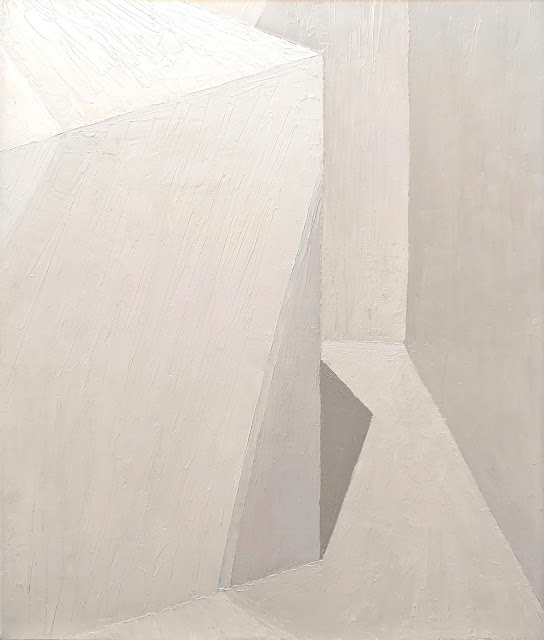
- Choose a simple white object with a white background. We used a white cube in a white corner, so there were distinct changes of value rather than a curved surface.
- Paint each change in color/value as a distinct shape without blending.
- Mix each color/value as accurately as possible before moving on to the next color/value shape.
- If a new color/value makes a previous section look wrong, scrape it off and correct the error.
For the record, I scraped and repainted every section multiple times because I discovered that every new color I added affected the previous color/value. Why? Because they are relative to each other!
Did you accept the Art Challenge? Share your progress on our private forum with friends of the Art Verve Academy.
| Follow Lisa Larrabee on her instructional blog at lisalarrabeeart.blogspot.com or visit her website at Larrabeeart.com. |
| Sponsored by the Art Verve Academy. Enroll in studio art classes for adults in Tucson, Arizona, at ArtVerveAcademy.com. |


