Temperature is one of the color's many characteristics. It describes the warmness or coolness of a hue or color relative to another hue. In nature, fire and ice are incredibly contrasting polar opposites.
 |
| Fire and Ice |
Color temperature was familiar to artists before the 19th century. However, in 1813, English artist Charles Hayter published this diagram in his book Introduction to Perspective, Practical Geometry, Drawing, and Painting, New and Perfect Explanation of the Mixture of Colors.

|
| Hayter's Warm/Cool Diagram |
The Temperature in Pigments
The warm and cool color diagram raised questions that caused multiple editions to be published.
Is every hue or color on the color wheel either warm or cool? Are some hues excluded as neither warm nor cool?

|
Color as Temperature |
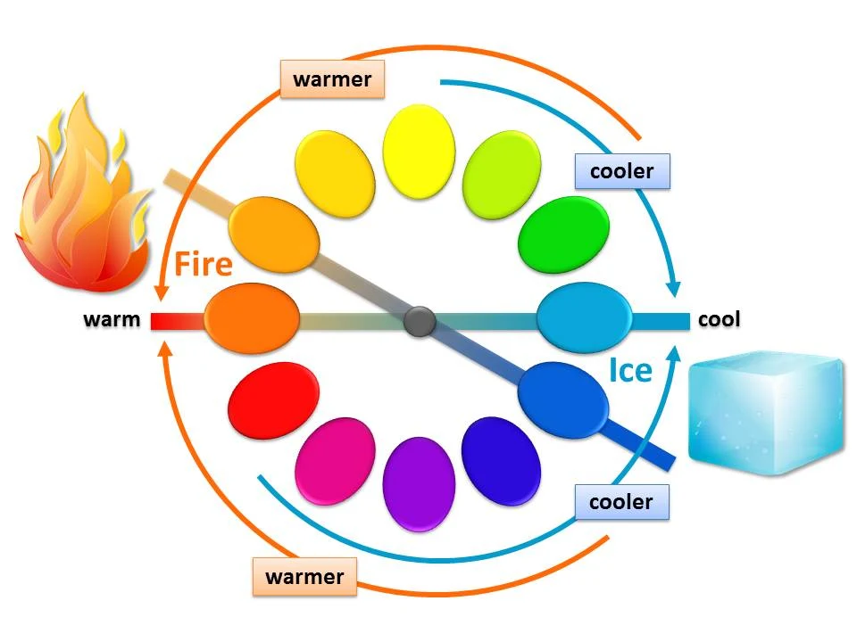
A warm or cool characteristic can be assigned to any hue or color on a color wheel. All hues or colors within the visible spectrum of light are present. In this context, red and orange are always warmer colors than blue and green.
We can split the color wheel into the polar opposites of nature's 'Fire and Ice.' Fire is close to orange, and ice is close to blue. Note that with all hues in the color wheel, hues gradually get warmer as they approach orange (fire). Hues gradually get cooler as they approach blue (ice).
|
| Color temperature in pigments or paint is always relative to its surroundings. |
The confusion in Hayter's diagram comes when we take the hue or color off the wheel and put it into another context. Color temperature is always relative to its surroundings.
 |
| Pink is the cooler color or hue compared to the red hue. |
For example, when the temperature in our environment drops to 32 degrees Fahrenheit, it feels really cold. However, 32 degrees Fahrenheit feels relatively warm after being in an environment of 11 degrees Fahrenheit for a day or two.

|
| Warm vs. Cool |
Color temperature in pigments or paint works the same way. It appears relatively warmer or cooler to the hues or colors around it. This optical illusion is even more apparent within a single hue family or color.
Pink is a great example. It is generally a warm color used during Valentine's Day in cards or candy boxes. However, when pink is next to red, it becomes a relatively cool hue compared to red, as shown.
If we zoom in on a single hue family on the color wheel, blue gets cooler as it approaches green and warmer as it approaches red. This is in context. Painters refer to this when they say, "a warm blue or a cool blue."
Don't confuse color temperature with color bias or undertones. That's an entirely different topic that will be addressed in another blog.
Temperature in Light
One last thing to address is the temperature of the light. The French Impressionists were obsessed with it. They could paint the same scene in the morning and afternoon with two different color schemes based on lighting effects and the time of day.

|
| Sunlight Temperature |
Lighting is essential in the perception of color. It transforms the vital visual information we receive from the object and affects the paint color. When comparing colors, use consistent lighting as you observe to get the same results.
Temperature is one of the color's many characteristics. It describes the warmness or coolness of a hue or color relative to another hue. In nature, fire and ice are incredibly contrasting polar opposites.
| Sponsored by the Art Verve Academy. Enroll in studio art classes for adults in Tucson, Arizona, at ArtVerveAcademy.com. |